
Why Responsive Website Design Is Important (Boost UX, SEO & Conversions) Have you ever tapped on a link on your phone only...
Picked Digital is one of the best data-driven digital marketing agencies in Bangladesh. We provide a wide range of digital marketing services to help businesses grow and succeed online.
Have you ever tapped on a link on your phone only to find a jumbled mess of tiny text and broken images? It’s frustrating when a website doesn’t work on your device, and most users will immediately hit the “back” button to find a competitor that offers a smoother experience. Ensuring your digital presence is accessible and enjoyable, regardless of the screen size, is no longer just a nice-to-have feature—it is the foundation of modern web success.
In this guide, you will discover exactly why responsive website design is important and how it can transform your online performance. We’ll cover everything from boosting your search engine rankings to keeping your visitors engaged longer, ensuring you have the knowledge to build a site that works for everyone. Let’s dive into the essentials of creating a seamless experience for every visitor.
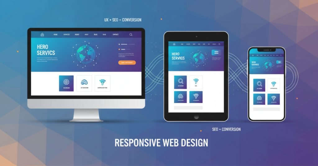
In the early days of the internet, designers only had to worry about desktop monitors. Today, the landscape is vastly different. Users access the web from smartphones, tablets, laptops, smartwatches, and massive desktop screens. Responsive web design is the approach that suggests design and development should respond to the user’s behavior and environment based on screen size, platform, and orientation.
Here is why adopting this strategy is critical for your business growth and user satisfaction.
User experience is the cornerstone of any successful website. If a visitor lands on your site and has to pinch and zoom to read your content, they are having a poor experience. Responsive design ensures that your site adapts layout, font sizes, and navigation to the user’s specific device.
When users can navigate your site intuitively without technical friction, they are more likely to stay, read your content, and interact with your brand. A seamless experience builds trust. It signals to the user that you care about their time and convenience, which is the first step toward converting a casual browser into a loyal customer.
Mobile internet usage has skyrocketed over the last decade. Statistics consistently show that over half of all global web traffic originates from mobile devices. If your website is designed only for a desktop experience, you are effectively ignoring more than 50% of your potential audience.
Responsive design ensures you capture this massive segment of the market. Whether someone is browsing on their commute, checking prices in a store, or relaxing on the couch with a tablet, your site will look professional and function perfectly. Neglecting mobile users isn’t just a design oversight; it’s a significant business risk.
Google and other search engines prioritize user experience. Because a significant portion of searches happens on mobile devices, Google has shifted to “mobile-first indexing.” This means Google predominantly uses the mobile version of the content for indexing and ranking.
If your site is not responsive, it will likely suffer in search engine results pages (SERPs). A single responsive website is also easier for search engine bots to crawl and index compared to maintaining separate desktop and mobile sites. By implementing responsive design, you are directly telling search engines that your site is modern, accessible, and worthy of a higher ranking.
A “bounce” occurs when a user visits a page on your website and leaves without interacting with it. High bounce rates are often a symptom of poor design or usability issues. If a mobile user lands on a desktop-formatted site, the navigation is often too small to use, and the content is hard to read, leading to an immediate exit.
Responsive design keeps users engaged. When content is presented clearly and navigation is effortless, visitors are encouraged to click through to other pages, read more articles, or explore your products. Increased time on site and deeper engagement are positive signals to search engines and usually correlate with higher conversion rates.
In the past, companies often maintained two separate versions of their website: one for mobile and one for desktop. This meant twice the work for content updates, twice the maintenance costs, and two separate SEO strategies.
Responsive design eliminates this redundancy. You manage one website with a single codebase. Updates made to your content management system (CMS) appear instantly across all devices. This unified approach saves time for developers and content managers, reduces long-term maintenance costs, and ensures your brand messaging is consistent everywhere.
Understanding why responsive website design is important is the first step; understanding how it works is the next. It isn’t magic—it’s a collection of specific design techniques and coding practices.
The foundation of responsive design is the fluid grid. In the past, websites were built using pixels, which are fixed units of measurement. If a container was set to 800 pixels wide, it would always be 800 pixels, regardless of the screen size.
Fluid grids use relative units like percentages instead of fixed pixels. For example, a column might be defined as taking up 50% of the screen width. On a massive desktop monitor, that 50% is wide; on a smartphone, that 50% is narrow. This flexibility allows the layout to stretch and shrink dynamically to fit the container it is viewed in.
Just like the grid, images need to adapt. A large, high-resolution image that looks great on a desktop can break a mobile layout if it doesn’t resize. Or worse, it can slow down the page load time significantly if the full file size is downloaded for a tiny screen.
Responsive design uses CSS code to ensure images are never wider than their container (typically using max-width: 100%). This prevents images from overflowing and disrupting the layout. Advanced responsive techniques also involve serving different image file sizes based on the device, ensuring mobile users don’t waste data downloading massive files they can’t fully appreciate.
Media queries are the “brains” behind responsive design. They are filters in your CSS code that detect the user’s device characteristics, specifically the width of the viewport (screen).
Developers use media queries to set “breakpoints.” For instance, a breakpoint might be set at 768 pixels (the width of a typical tablet). The code might say: “If the screen is smaller than 768 pixels, stack these three columns on top of each other instead of side-by-side.” This allows the layout to fundamentally change shape based on the available space, ensuring optimal readability at every size.
The navigation bar is often the trickiest element to translate from desktop to mobile. On a wide screen, a horizontal menu with dropdowns works perfectly. On a phone screen, that same menu would be illegible.
Responsive design typically utilizes the “hamburger menu” (the three horizontal lines) for mobile views. When tapped, this icon expands into a vertical drawer or list. This keeps the header clean and uncluttered while still giving users access to all site pages.
Desktop users navigate with a mouse, which offers pixel-perfect precision. Mobile users navigate with fingers, which are much less precise. Responsive design accounts for this by adjusting the size of interactive elements.
Buttons on mobile views need to be larger and have more padding (space) around them to prevent “fat finger” errors—where a user accidentally taps the wrong link. Form fields also need to be large enough to tap easily, and input types should trigger the correct keyboard (e.g., bringing up the number pad for a phone number field).
We briefly touched on SEO earlier, but the relationship between responsive design, performance, and search visibility runs deep. Google’s algorithms are increasingly sophisticated, focusing heavily on “Core Web Vitals,” which measure speed, responsiveness, and visual stability.
Mobile users are often on cellular data networks which can be slower or less stable than home Wi-Fi. Responsive design practices often encourage “mobile-first” development. This philosophy prioritizes loading essential content first and keeping code lightweight.
When a site is optimized for responsive viewing, it usually loads faster across all devices. Page speed is a known ranking factor for Google. A faster site not only ranks better but also converts better—studies show that a one-second delay in page load time can result in a 7% reduction in conversions.
If you run a separate mobile site and a desktop site, search engines might view this as duplicate content. This can dilute your link equity and confuse search algorithms about which version of the page to rank.
A responsive site serves the exact same HTML code on the same URL regardless of the device. This consolidates your link equity and authority into a single place, making your SEO efforts much more potent.
Responsive design makes social sharing easier and more effective. If a mobile user shares a link from your separate mobile site on Facebook, and a desktop user clicks that link, they might be taken to the stripped-down mobile version on their big screen. This looks unprofessional and provides a poor experience.
With a responsive site, the URL is always the same. No matter who shares the link or what device the recipient is using, the website will render perfectly for them. This encourages more sharing and wider distribution of your content.
If you are planning a redesign or building a new site, following best practices is essential to ensure your site is truly responsive and not just “squishy.”
Start your design process by considering the mobile experience first, then scale up to tablet and desktop. It is much harder to cram a complex desktop interface into a phone screen than it is to expand a clean mobile interface onto a larger screen. This approach forces you to prioritize the most important content and features, leading to a cleaner, more focused design overall.
Don’t just design for specific devices (e.g., “iPhone 15” or “iPad Pro”). New devices with different screen sizes are released constantly. Instead, design for the content.
Create a breakpoint where the design starts to look broken or cramped. If your three-column text layout becomes unreadable at 800 pixels wide, that is where you should add a breakpoint to switch to a two-column or one-column layout. Common breakpoints usually hover around:
Text needs to be readable without zooming. A good rule of thumb is to use a base font size of at least 16px for body text on mobile. Use relative units like em or rem rather than fixed pixels for font sizes, so they scale appropriately with the user’s browser settings. Also, ensure there is enough contrast between the text and the background to meet accessibility standards.
Emulators and browser resizing tools are great for development, but they don’t tell the whole story. You need to test your website on actual hardware. See how it feels to hold the phone in one hand and navigate. Check if the buttons are easy to reach with a thumb. Real-world testing reveals usability issues that code inspectors often miss.
Large images and uncompressed code are the enemies of responsive performance. Use modern image formats like WebP, which offer high quality at smaller file sizes. Use tools to “minify” your CSS and JavaScript files, removing unnecessary spaces and comments to reduce file size.
Responsive design is not a static concept; it evolves as technology evolves. We are now seeing the rise of foldable phones, dual-screen devices, and ultra-high-resolution 4K and 5K monitors.
We are also moving toward “intrinsic design,” where layouts are even more flexible, relying less on rigid breakpoints and more on the inherent size of the content itself. Additionally, accessibility (making the web usable for people with disabilities) is becoming more intertwined with responsive design. A site that adapts to a screen reader or a high-contrast mode is, in a sense, responding to the user’s needs just as much as one that adapts to screen size.
Understanding why responsive website design is important prepares you for these future shifts. It instills a mindset of flexibility and user-centricity that will serve your business well, no matter what new device hits the market next year.
Embracing a Responsive Future
The question is no longer “should we make our website responsive?” but “how can we make our responsive experience even better?” We have explored how responsive design improves user experience, captures the massive mobile market, boosts your SEO rankings, and simplifies your website maintenance. It is the single most impactful investment you can make in your website’s infrastructure.
If your current website struggles to adapt to different screens, you are leaving money on the table and frustrating your visitors. By prioritizing responsive design, you ensure that your digital storefront is welcoming, professional, and accessible to everyone, everywhere. It is time to audit your site, embrace flexibility, and build a web presence that is ready for the future.
For a fully optimized and responsive site, explore our professional website design services.
What is responsive website design?
Responsive website design is a development approach where a website’s layout and content automatically adjust to fit the screen size of the device being used. This ensures that whether a visitor is on a smartphone, tablet, or desktop, the site remains readable, navigable, and visually appealing without needing a separate mobile URL.
How does it affect SEO?
Responsive design significantly boosts SEO because Google prioritizes mobile-friendly websites in its search rankings. By providing a single URL for all devices, you make it easier for search engine bots to crawl your site and avoid penalties associated with duplicate content or poor mobile user experiences.
Can I make my existing website responsive?
Yes, you can retroactively make an existing website responsive, though the difficulty depends on how the site was originally built. In many cases, it involves updating the CSS (styling code) and HTML structure, but sometimes a full redesign using a modern, responsive framework is more cost-effective and produces better results.
Is responsive design important for all devices?
Absolutely, responsive design is crucial for every internet-capable device, from the smallest smartwatch to the largest smart TV. It future-proofs your content, ensuring that no matter what new gadget your customers use next year, your website will still function correctly and look professional.
How do I test if my website is fully responsive?
You can quickly test responsiveness by shrinking your desktop browser window to see if the layout adapts, or by using Google’s free “Mobile-Friendly Test” tool. For a more thorough check, use the “Inspect Element” developer tools in Chrome or Safari to simulate various specific mobile devices and screen resolutions.
Why Responsive Website Design Is Important (Boost UX, SEO & Conversions) Have you ever tapped on a link on your phone only...

How to Optimize E-commerce Product Pages for More Sales Are you pouring money into ads only to see visitors leave without buying?...

How to Buy a Domain from Namecheap How to Buy a Domain from Namecheap (2025 Guide) Starting a website or online business...

How to Choose the Right SEO Service in 2025 (Backed by Strategy & Results) How to Choose the Right SEO Service in...
Copyright 2025 © Picked Digital, All Rights Reserved.